
 32 C
32 C Best Infographics
Elections 2026Top News / Best Infographics

If you could travel a few centuries back in time, youd notice that buildings were a lot smaller. These days we have many iconic tall skyscrapers around the world. Have you ever wondered how buildings have evolved over the past couple of centuries? This infographic takes a look: The post The Evolution of Skyscrapers [Infographic] appeared first on Best Infographics .
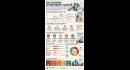
We hear about housing affordability issues in the US all the time these days. Unlike what some have suggested, it is not a hoax and is making it hard for people to buy or even rent quality places. This infographic from Rad Neurons takes a look the housing affordability squeeze: The post The Housing Affordability Crisis Visualized appeared first on Best Infographics .

Water fasting is one way to achieve metabolic reset. You will want to do your homework and approach it in a smart, safer way. This infographic from Fitness Gizmos takes a look at some of the challenges of going on such an extreme diet: The post Water Fasting Challenges [Infographic] appeared first on Best Infographics .
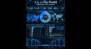
Data centers have become quite a hot topic these days. There is a lot of talk about who should control AI and at what pace development should happen. Have you ever wondered how the US stacks up against the world when it comes to data centers? This infographic takes a look: The post Data Centers: US vs. the World [Infographic] appeared first on Best Infographics .

We all know how high diesel prices can affect the price of everything else. Have you wondered why diesel prices are so high? This infographic from Best-Infographics takes a look: The post Why Diesel Is So Expensive? [Infographic] appeared first on Best Infographics .

Those of you who are curious about nature have probably learned some of the insane facts about it. For example, we all know animals that have strange characteristics or mating routines. The difference in scale can also be mindblowing. Have you ever wondered how many ants weigh as much as a whale? This infographic takes [] The post How Many Ants Weigh As Much as a Whale? [Infographic] appeared first on Best Infographics .

Have you ever seen successful people with great ideas and wondered how they keep coming up with them? You need more than just curiosity and discipline to pull it off though. This infographic from Rad Neurons shows great ideas are all about: The post What Actually Makes a Great Idea [Infographic] appeared first on Best Infographics .

A lot of us get so busy in life that we lose perspective of how small we are in the bigger scheme of things. Our universe is quite vast with mindbending, large celestial objects as this infographic from Gadgteify shows: The post Where Do You Fall In the Universe? [Infographic] appeared first on Best Infographics .
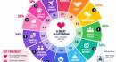
Picking a partner is a huge decision. An incompatible partner can make life hard for both of you. Have you ever wondered what matters most to people when picking a partner? This infographic from Best-Infographics takes a look: The post What Matters Most In a Partner? [Infographic] appeared first on Best Infographics .

Those of you who buy your coffee regularly know it can be quite expensive. Have you ever wondered why a cup of coffee costs so much? This infographic from CookingGizmos takes a look: The post Why Does A Cup of Coffee Cost $5? appeared first on Best Infographics .
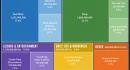
We have 8b people on this planet, each spending their way in their own unique way. Most of us have to sleep, do household chores, work, and learn though. This visual from Gadgetify takes a look at how the world spends its hours: The post How the World Spends 7B hours [Infographic] appeared first on Best Infographics .

We hear about capitalism and socialism all the time. A lot of people use these terms but dont know the difference between them. This infographic from Rad Neurons covers what separates capitalism from socialism? The post What Separates Capitalism from Socialism? appeared first on Best Infographics .

Weeks go by without us paying a whole lot attention to them. Even if you live to 90 years, you only get 4680 weeks, so every one is precious. This infographic from Best-Infographics visualizes how people spend their time through the lifetime: The post A Life In Weeks [Infographic] appeared first on Best Infographics .

It is no secret that many institutions and households hold lost of wealth in financial assets. Its not all cash either. This infographic from Gadgetify covers where global wealth is stored: The post Where Does Money Sit While It Sleeps [Infographic] appeared first on Best Infographics .

Not taking care of your teeth could end up costing you big time in the future. Lets not forget that getting a crown or implant can cost a fortune. This infographic from Oris Dental takes a look at 15 common dental problems: The post Top 15+ Dental Problems and Their Treatment [Infographic] appeared first on Best Infographics .

It is not easy to become a billionaire or everybody would be doing it. A lot of folks who hit those kinds of wealth levels know how to invest and spend their money to grow their wealth and continue being a billionaire. This infographic from Rad Neurons covers where billionaires put their money: The post Where Billionaires Put Their Money? [Infographic] appeared first on Best Infographics .

Apple is going to announce a bunch of new iPhones soon. They are expected to have even better cameras, faster processors, and other new features. This infographic from Gadgetify covers how far iPhone has come since its debut: The post iPhone: from First Gen to iPhone 18 [Infographic] appeared first on Best Infographics .

When pros talk about the state of our economy, they often mention our GDP. It shows the total value of all goods and services produced in a country. Have you ever wondered which industries are contributing the most to Americas GDP? This infographic from Ooma takes a look: The post Which Industries Contribute the Most to Americas GDP? appeared first on Best Infographics .
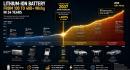
Batteries are playing a big role in our lives. Many are working to make them more efficient and safer. Lithium-Ion batteries have come a long way over the past few decades. This infographic from Rad Neurons takes a look: The post The Evolution of Lithium-Ion Batteries [Infographic] appeared first on Best Infographics .

Many of us got familiar with 16 personality types from the Myers-Briggs Type Indicator (MBTI) in school or college. It is one way to figure out what motivates you and what careers to pursue. You can also use it to figure out what other personality types would be a match. This infographic from Gadgetify takes [] The post INFP Personality: Profile & Matches [Infographic] appeared first on Best Infographics .
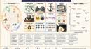
Many of us are guilty of being biased on certain topics without even knowing it. Cognitive biases can affect how we process information and judge reality. This infographic from Rad Neurons decodes 12 different cognitive biases: The post 12 Cognitive Biases Decoded [Infographic] appeared first on Best Infographics .

AI is growing in many countries around the world. Many people assume China and the US are the only players but other countries are starting to get more serious about AI adoption as this infographic from Gadgetify shows: The post Where AI Adoption Is Growing [Infographic] appeared first on Best Infographics .

The Toysmith Balancing Eagle is a cheap toy but can put on a show. It can balance on your finger as you give it a spin. There is no motor or magnetic about how it keeps it balance as this visual from Gadgetify explains: The post How Toysmith Balancing Eagle Toy Works appeared first on Best Infographics .

Those of you who have studied flags of different countries that many of them have certain symbols and elements in common. For example, Egypt, Albania, and Mexico all have an Eagle on their flag. This infographic from Feather Flags Express covers countries that feature eagles: The post Country Flags that Feature Eagles [Infographic] appeared first on Best Infographics .

With the recent conflict in the Middle East, we have heard about the potential for oil prices to explode further. Have you ever wondered why oil prices rise and fall in general? This infographic from Rad Neurons takes a look: The post Why Do Oil Prices Rise & Fall? [Infographic] appeared first on Best Infographics .

It is no secret that as we get older, we dont adopt new tech as fast as younger folks. We have all had seniors who struggle to get a handle on AI, livestreaming and other online tools. This infographic from Ooma covers how kids, parents and grandparents use technology differently: The post How Every Generation Uses Tech Differently appeared first on Best Infographics .
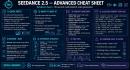
Seedance 2.5 is the most advanced video model. It can make 30 second videos and supports 50 references, including video and audio references. It is an expensive model, so if you are using it, you need to learn how to prompt it. This infographic from Gadgetify has a few tips on that: The post Seedance 2.5 Prompting Cheat Sheet appeared first on Best Infographics .

Have you noticed how some folks lose their mind when their favorite site goes down for even a few minutes? There is a reason businesses spend a lot of money to ensure close to 100% uptime. Even an hour downtime can cost businesses a fortune. This infographic from Ooma takes a look: The post Cost of 1 Hour Downtime to Businesses [Infographic] appeared first on Best Infographics .

When you spend long enough time on X and other social networks, you end up seeing all kinds of interesting and sometimes weird topics go viral. In the past few weeks, there have been a lot of talk on X about $20 burritos and who is responsible for those high prices. This infographic gives you [] The post The Anatomy of a $20 Burrito [Infographic] appeared first on Best Infographics .

When it comes to AI video models, Seedance 2.5 leads the charts but Hailuo H3 is not that far behind. It is an omni model that can generate stunning videos. You will need proper prompts to have success on it. This infographic serves as a guide to prompting for Hailuo H3: The post Hailuo H3 Prompting Cheat Sheet appeared first on Best Infographics .
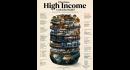
We all hear about high income folks buying all kinds of fancy houses and cars. Have you ever wondered what it would actually take to be among them and what it really looks like? This infographic from Rad Neurons takes a look: The post What Does High Income Looks Like Really [Infographic] appeared first on Best Infographics .
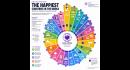
When it comes to the happiest countries around the world, Nordic countries often top the lists. A lot of things factor into that, including social support, freedom to make life choices, and generosity. This infographic from Rad Neurons visaulizes the happiest countries around the world: The post The Happiest Countries in the World [Infographic] appeared first on Best Infographics .
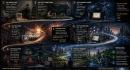
We cant go an hour without checking something on the internet. In fact, when it goes out, a lot of people get restless. Have you ever wondered how the internet took over the world? This infographic from Gadgetify takes a look: The post How Did the Internet Become Our World? {Infographic} appeared first on Best Infographics .