
 21 C
21 C FlowingData
Elections 2026INFOGRAPHICS / FlowingData
There is a proposition on the California ballot this year to impose a Tags: billionaires , California , New York Times , Nicholas Konrad , scale , taxes
This week, I walk through my own thinking as I poke at fresh data. Tags: analysis
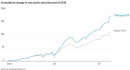
This is really going to surprise you, but the wealthy people in the Tags: rich , Wall Street Journal , wealth
In reference to the xkcd comic that illustrates the internet as a stack Tags: Internet , open-source , sheets.works
The Centre for the Study of the Legacies of British Slavery published a Tags: database , Guardian , Legacies of British Slavery , slavery
Daniel Willingham, a professor at the University of Virginia, argues that students should Tags: Daniel Willingham , education , students
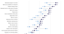
Data for Progress compared social activities among American adults in 1995 against 2026. Tags: Data for Progress , social
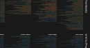
Torahmap by Danyel Fisher is an interactive visualization of the Hebrew Bible. Each Tags: Danyel Fisher , Tanakh , text
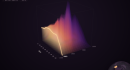
A population pyramid shows the age distribution of a population, usually with counts Tags: Karim Doueb , population , world

This week is about helping data stand out in the land of many points. Tags: attention , contrast
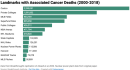
Harvard researchers published an analysis arguing that risk of cancer increases when people Tags: Breakthrough Institute , cancer , causation , Costco

Is there something that comes after we die? For the Pudding, Alvin Chang Tags: Alvin Chang , life , mortality , Pudding , religion
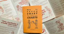
Duncan Bradley made a zine of one-liners from data visualization folks. It is Tags: Duncan Bradley , guide

Over summer break, MIT installed over 500 AI-enabled surveillance cameras around campus. In Tags: camera , MIT , privacy
This week is about finding your way by getting lost in the data. Tags: creativity , process
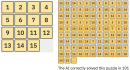
Large language models are heavily dependent on training data to determine what comes Tags: Aatish Bhatia , puzzle , training

Jane Wickline impersonated Anthropic CEO Dario Amodei for Saturday Night Lives Weekend Update. Tags: Dario Amodei , doom , humor , Jane Wickline , Saturday Night Live
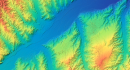
Bert Spaan, with help from Jules Schoonman, made an elevation map for the Tags: Bert Spaan , elevation , world
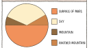
New to me, Tom Gauld, for New Scientist, made a fine pie chart Tags: comic , humor , Mars , New Scientist , Tom Gauld

Thin Air, Real Money is a game to help you understand the cryptocurrency Tags: cryptocurrency , game
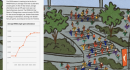
Celebrating 30 seasons of the WNBA, ESPN has a fun piece on the Tags: basketball , ESPN , WNBA
Here's what happened in September. Tags: roundup
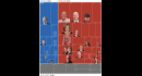
Using data from the Federal Election Commission, the Washington Post called out the Tags: donors , election , politics , Washington Post

A live Caltrans feed of the southbound 101 highway in California is translated Tags: highway , music , traffic
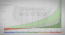
Continuing the four-part series on wealth inequality in America, the most recent video Tags: income , inequality , politizane
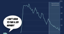
When you think about how the economy is doing these days, it can Tags: economy , perspective , Reuters
For 404 Media, Jason Koebler collated the dumb emails they receive from dumb Tags: 404 Media , annoying , bot , email

This week, there were a lot of trade-offs between utility and aesthetics. How do you find the balance? Tags: trade-off
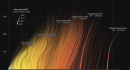
Summer 2026 is likely the hottest summer on record since 1895. The NYT Tags: climate change , heat , New York Times
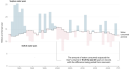
The Colorado River is at risk due to drought and states using more Tags: Colorado River , consumption , drought , Reuters , water
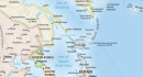
The United Nations voted to support the Equal Area map projection, which more Tags: cartography , Guardian , Japan , world

9/11 in Realtime, developed by Robbie Byrd, replays the news on the day Tags: 9/11 , news , real-time , Robbie Byrd

In 2013, a video on U.S. wealth inequality was posted to YouTube by Tags: politizane , wealth
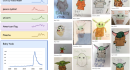
Riley Walz charted drawing trends on student art portfolio Artsonia. Kids shape culture, Tags: Artsonia , drawing , Riley Walz , trends

This week is about adapting our visualization workflow as the tools change dramatically. Tags: analysis , tools
Mathematician Terence Tao, a 2006 Fields Medal winner and professor at UCLA, discusses Tags: Big Think , math , paradox , Terence Tao
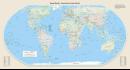
Last year, the African Union pushed for wider adoption of the Equal Area Tags: Africa , area , cartography , Guardian , projections

Imagine a pottery wheel that turns clay on an axis. A potter forms Tags: curve , Karim Doueb , pottery
This week, I describe the many small choices one must make while working on a set of charts. Tags: behind the scenes

There are thousands of crew members aboard U.S. warships in the Middle East. Tags: Iran , logistics , New York Times , war
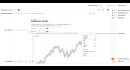
Observable, known for visualization-centric notebooks to share code, restarted fresh to adjust for Tags: notebook , Observable
Due to Covid, Indias census count is overdue by five years. But theyre Tags: Bloomberg , census , India , population
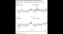
The summer of 2026 will most likely be the hottest summer on record Tags: global warming , temperature , Washington Post
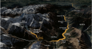
For the New York Times, Pablo Robles, Leanne Abraham, and Josh Holder mapped Tags: flood , Nepal , New York Times
Flock Safety has been getting some hate lately, because as it turns out, Tags: Darth Vader , Flock , privacy
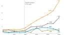
It is trivial to generate bodies of text on infinite topics, so of Tags: Internet , Pew Research , writing
Here is what happened in August. Tags: roundup
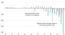
For the Washington Post, Jeremy B. Merrill analyzed newsletters and social media posts Tags: data center , politics , Washington Post

There is a simple law from John Hack that says the length of Tags: drainage , Quanta , rivers
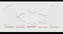
Older people are working later in life and younger people are not entering the labor force as early. Tags: labor force , work