SENSEX
NIFTY
GOLD
USD/INR

Weather

image 21    C

World News

Macworld

World / Macworld

details

HomeView is right to break the rectangular mold

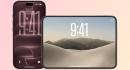
Macworld It can take a while to get used to the design of a completely new Apple product. Vision Pro, AirPods Max, even iPhone Duo all looked bizarre when they were first unveiled. So it shouldnt be a surprise that right now, I feel like the HomeView looks weird. Possibly because its so square . Technically, of course, the screen of the HomeView is not a square but a squircle, because of the rounded corners. Everyone knows that the squircle was Steve Jobs favorite shape, which is why it crops up so much in Apple software design. But it crops up less often in the companys hardware design (the Apple TV and Mac mini are the main exceptions here), and almost never in the shape of its screens. Until now youd struggle to find a square or squircular screen on an Apple product anywhere other than the Apple Watch, which I assume is why, in its unexpectedly premature exclusive, Wired described the HomeView as a giant Apple Watch for the home. In general, screens are expected to be rectangular. Look at your TV, laptop, phone, tablet, and gaming handheld; even microwaves and smart fridges are likely to have rectangular displays in landscape and portrait orientation, respectively. You can argue a shape thats longer in one dimension than another is more practical in many contexts: qwerty keyboards, movies, games, photos, and books all work better that way. And a rectangle is more flexible than a square, because its really two shapes in one. But regardless of the practicalities, weve simply reached a point where our eyes are accustomed to the oblong and find square screens odd. Until now, Apple has understood and deferred to the pre-eminence of the rectangle. That, after all, is why the iPhone Duo looks the way it does. Again, we get used to these things, but when its design was first leaked the Duo was called weird, so strange, and a little shorty! It needed to be stubbier than most smartphones so that, when it was unfolded, its screen would be rectangular rather than square. Who wants their phone to have a square screen? Nobody. Not pictured: anything square. Apple Which brings us back to the HomeView, which has exactly that. Unlike with the Duo, no great sacrifices would have been necessary to give it a rectangular screen instead. It could very easily have been given a screen closer to the dimensions of a large iPhone or a small iPad, and with a few alterations to the arm on the tabletop model, this could even have been given the power to rotate through two different orientations. It would have been both more versatile and more familiar. The fact that Apple didnt go down this path, after working so hard to ensure that the iPhone Duo has a rectangular screen in both folded and unfolded formats, makes it clear that the company thinks square is best in this specific use case. And on reflection, I think its probably right. On the practicalities front, a few of the drawbacks of a square screen apply here. Youre not going to be watching movies or TV shows on the HomeView, or playing games. Youre not going to be reading eBooks or lengthy online articles, browsing your photo collection, or typing out emails or work documents. The screen is just there to let you monitor your home tech and control it with a few taps, chat to people using FaceTime, and look up the odd recipe. Its a screen that plays far less of a role than that of an iPhone or a Mac. In that sense, it really is more like the screen on an Apple Watchsomething to use when your iPhone isnt in your hand. Would this make sense in rectangular format? Not so much. Foundry And on the HomeView, as on the Apple Watch, a square does make sense. A low-interaction screen should ideally be big enough for its information to be visible to the user at a convenient distance, and no bigger. If the HomeView had a wider screen, it would be harder to fit into small spaces in the home. If it had a taller screen, it would be more obtrusive. In terms of its visual footprint, the square is the most efficient shape to choose. The only downside I can see is that the HomeViews design currently looks a bit weird. But if past Apple products are anything to go by, well get used to it before long. This article is an expanded version of a post David Price wrote for Macworlds Welcome Home live blog, which you can read here .

15 Oct 2026 4:00 pm